Take another look at the “fallen” strap itself. ![]()
I still don’t see anything that’s not there.
Okay, I’ll give. In real life, the strap would be hanging loosely downward and as more of a loop. In Sargent’s rendering, the strap clings to the lower part of the shoulder muscle in apparent defiance of gravity and is actually pointing somewhat upward, as if it were an armband.
In terms of composition, it makes perfect sense, as the angle of the strap echoes, in a general way, the angle of the projecting bunch of fabric (or whatever it is) in her grasp, the perceived angle of the far edge of the table, the angle of her left shoulder, and the angle of the top of her head, as well as the line between her ear and nostril, and the line from hand to hand. A subtly cohesive result.
If the strap were rendered more “realistically”, the result would have been somewhat disorderly. Artistic license: 1; reality: 0.
The other possibility is that the strap was actually an armband by design, but you would have to still glue it to the arm to get it to stay in such a position.
So who needs reality? ![]()
Not me, so long as I’ve got good art.
And music.
Hmm, still disorderly as it is though, with the strap being far too short and out of proportion than the other. Actually, that whole left side of the midsection is way off - the angles and proportions are not really possible, and they don’t “look” correct either, that is to say, artistic license hasn’t made an apropriate illusion.
Picasso is quoted as having said both “Painting is a lie that tells the truth” and “Art is a lie that tells the truth” Either way, the midsection and the model’s fallen strap fail in this regard, and it’s pretty obvious.
Loren
P.S. But don’t get me wrong, I’m not knocking Sargent’s work, he was a highly skilled artist, and I really enjoy much of his work.
Loren
The beauty of it is, Loren, that you have to really inspect the details as you have done to see those things. The overall effect, without the inspection, works very well, I think.
Savvy artists do that sort of thing all the time in the name of composition. Proportion is another thing that gets toyed with. Michaelangelo was a master of it. Take his David, for example: the head is disproportionately large to the body. If the head were in more proper proportion, David’s expression (which is a key component in the work, I think) would have been less “punctuated”, and the overall effect would have been less impressive. Another example would be Michaelangelo’s Pietá. Mary is disproportionately large to the body of Jesus. Without that trick (which tends to be overlooked until it’s pointed out, just like David’s head), the gravitas of the whole would be arguably less.
On closer inspection, I’m not seeing an illusion, there, or a disproportion. If you look closely, and it’s not obvious due to the black fabric, there appears to be extra decorative fabric hanging from the straps’ bosses or thereabouts and meeting from the top’s sides downward toward a “V” point in front. That would explain the seemingly strange look to the left (her right) side: it’s not a waistline or the cut of the bodice, but the result of the angle from which we see how the fabric falls. That’s what I’m seeing, anyway, and it’s cleared that question up for me.
Oh, and sorry for the hijack, flanum. ![]()
There won’t be a quiz. ![]()
Nano wrote:
“The beauty of it is, Loren, that you have to really inspect the details as you have done to see those things.”
Yup, I suppose I’m a “victim” of having grown up with a grandfather who was an accomplished artist, and art educator (Author of several books and director of Art Education for the Philadelphia Public School System, back when they still taught, and valued such things in our education system), so perhaps I sometimes see “too much” ![]() Although I’m not “educated” in art as such, at least not in the strict formal sense.
Although I’m not “educated” in art as such, at least not in the strict formal sense.
“The overall effect, without the inspection, works very well, I think.”
Agree, again, I wasn’t being critical per se, just commenting since we were on the subject.
“Savvy artists do that sort of thing all the time in the name of composition. Proportion is another thing that gets toyed with. Michaelangelo was a master of it. Take his David, for example: the head is disproportionately large to the body.”
As are the hands and…
“If the head were in more proper proportion, David’s expression (which is a key component in the work, I think) would have been less “punctuated”, and the overall effect would have been less impressive.”
Of course the common acknowleded theory is that Michelangelo exaggerated the size of certain elements with the idea that the David statue would be placed much higher relative to the viewer, and that had he known the statue would be mounted at or just above street level, he’d have done things a bit differently. Of course there are other theories as well, but we’ll never know for sure, unless some long lost writing on the the subject by the artist himself happens to surface.
“Another example would be Michaelangelo’s Pietá. Mary is disproportionately large to the body of Jesus. Without that trick (which tends to be overlooked until it’s pointed out, just like David’s head), the gravitas of the whole would be arguably less.”
I’m not familiar enough with the history of that piece to comment.
Gotta love art though. What a pity it’s poorly valued by the masses today.

Jack Bookbinder
Loren
I would like to know whether Madame X’s nose was that extraordinary in real life, or whether there was artistic license at play.
It was extraordinary. She was a very refined, very white, very extraordinary lady.
The painting is based on a photograph. I’ll see if I can find the photograph.
The photograph:
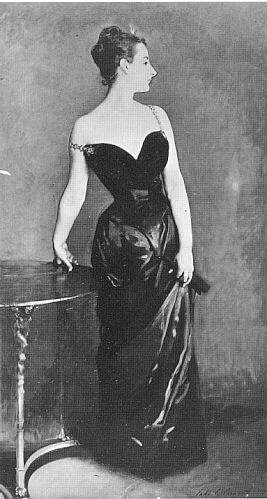
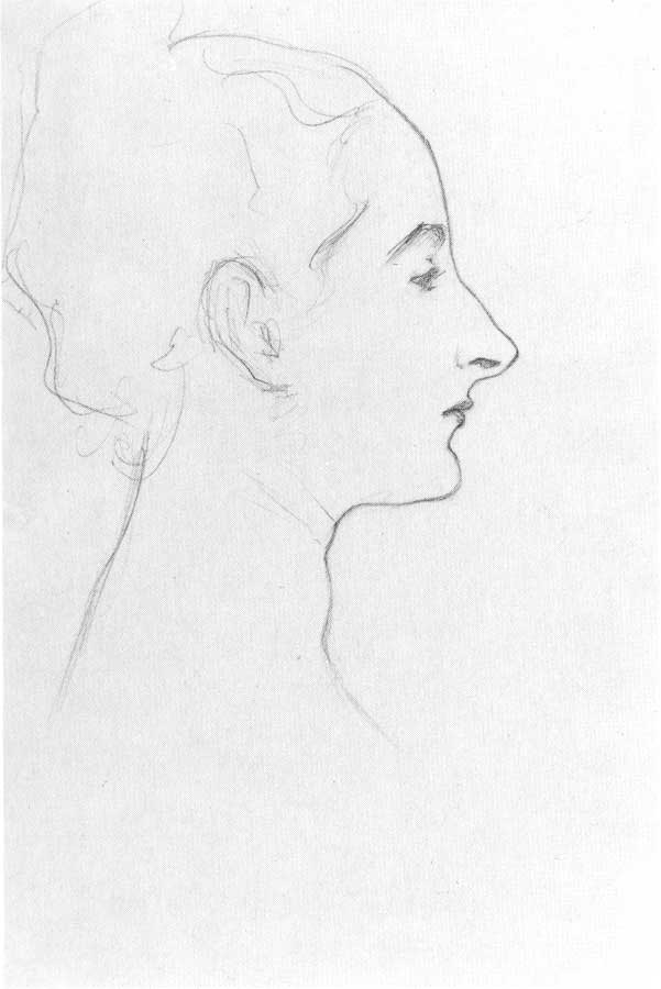
A study done of her before the painting:
She had one of the most beautiful bone structures I’ve ever seen.
That’s not a photograph.
Having her tilt her head back away a bit from the viewer in the painting slightly decreases the size of the ol’ snozzola a bit, which is shown to be more of a honker in the sketch.
djm
The website I got it from (see the image properties) says it’s a photograph.
It says it’s a photograph of the painting.
Oh. I suppose I had it backwards (photograph of the painting/painting of the photograph). I can’t tell well with the old photographs anyway. Ooops.